Moribund, chronically-blocked writer Eddie Morra [Bradley Cooper] is offered NZT, a neuro-enhancing designer drug which enables the user to access 100% of his brain. His girlfriend, magazine editor Lindy [Abbie Cornish,] has dumped him, so the apathetic and pathetic Eddie pops the pill and changes his life.
The murky world Eddie inhabited pre-NZT becomes more vibrant and kinetic as he daily doses. His world falls back into desaturated hues when he’s not on the drug, but is filled with bright clarity when he is. Eddie becomes a multi-lingual, multi-talented, multi-tasking phenomenon—he transitions into the realm of power and play, facilitating a major merger for financial mogul Carl Van Loon [Robert De Niro], partying the jet set circuit and reconciling with Lindy. There’s a price to pay, of course, as he pushes the envelope to stay alive and ahead in this fast-paced, visually exciting action-thriller.
Director Neil Burger, Production Designer Patrizia van Brandenstein, Set Decorator Diane Lederman SDSA and the crew established visual languages for each phase of the story. Burger says, “…To give the audience the feeling of being inside Eddie’s head…each phase has a particular color palette, camera movement, design concept and acting style. I wanted the audience to always feel what he was feeling, to be zooming along with him.”
SET DECOR talks with Lederman about the making of the film and the process of set decoration.
SET DECOR:Please tell us about the palettes…
Set Decorator Diane Lederman SDSA: Contrast was the visual vocabulary we used to distinguish the two different states of mind of our main character. Eddie’s pre-NZT world was, for the most part, monochromatic. Once on NZT, the world—his world—became alive with light and color. We worked very hard to make this happen with the set dressing, and palette was a defining method to accomplish this task.
In many ways for me, the greater challenge was to create his pre-NZT world. Carefully choosing set dressing that ranges from shades of grey to grey greens and keeping to that color scheme was not as easy as it sounds.
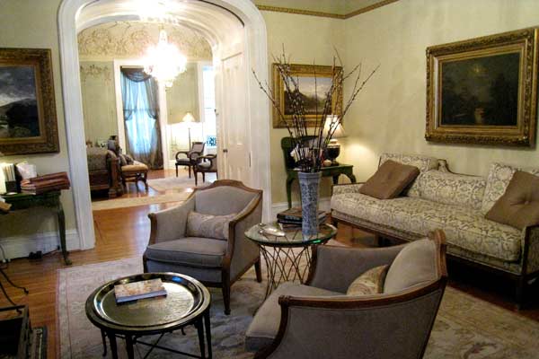
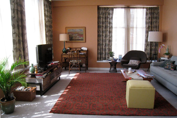
Contrast was also key to the palette and set elements for Lindy’s apartment—the contrast between Eddie’s pre-NZT squalor and the orderly haven that was Lindy’s.
Lindy is the only virtuous character in the film. Even once she has a taste for NZT, she does not fall prey to its effects. She immediately recognizes its danger. It was important to us for her world to feel grounded, safe, calm—thus an earthy palette for her. Plants…the flowered theme seen throughout the art, curtains and décor…touches of folk art…the pottery collection…all meantto invoke a feeling of wholesomeness and to connect her to the earth.
Director Neil Burger says, “Too often, New York is turned into a Hollywood set, but we wanted it raw and real and flowing around us. It’s a wild story that goes off on some crazy tangents and we tried to ground it in reality.”
Producer Scott Kroopf adds, “We shot on 52nd Street…Chelsea, Tribeca and all over midtown… and on the East Broadway part of Chinatown. It’s nuts because there are always a million people there.”
SET DECOR:Tell us about location shooting in NYC!
Lederman: Shooting on location in the streets of NYC definitely has its own particular challenges, somewhat like guerilla warfare at times, but when you grow up in the industry doing it, it becomes second nature. You definitely learn to think on your feet and act quickly.
I think NY is one of the most vibrant and inspiring places to work. There is a pulse to this city that is very exciting to move to, and allows access to the best the world has to offer.
Yes, there are tons of people on the street. However, New Yorkers are pretty jaded when it comes to film shoots. They are generally less interested in what we are shooting and more interested in how their street parking will be affected.
SET DECOR:Did you have interesting moments with set dressing deliveries, timing, etc?!
Lederman: This film was extremely demanding and challenging as far as bringing sets in on time.The schedule was very tight, and we often had to dress, shoot and wrap locations all on the same day. Even when we had prep time it was still always tight, but that is part of the challenge of doing a film that is primarily shot in locations as opposed to stage sets. Thank goodness for my assistant Wendy Brown and our incredible New York crew!
SET DECOR:Did you decorate the Philadelphia shoot as well?
Lederman: Yes, I did the all principle photography. I love Philadelphia. It’s a great city, and a great city to work in. There are some wonderful and generous vendors—no prophouses, so everything comes from local small business owners. I was very fortunate to have an accomplished buyer, Christine Wick, whose personal relationship with all of these vendors was paramount to the success of the sets. Philadelphia also boasts some very talented and able technicians—my dressing crew was amazing and pulled off some miracles with getting the sets ready on time.
SET DECOR: This is your third film with Production Designer Patrizia van Brandenstein. Please tell us about your collaborative process.
Lederman: I have been very fortunate to work with some extraordinary designers, and Patrizia is by far one of the best. I credit a good deal of what I know about dressing sets to working with and learning from Patrizia. She is extremely demanding and challenges me to make each set perfect, no matter how difficult the obstacles might be or how great the limitations, budgetary or otherwise.
She has a brilliant eye and a hundred tricks up her sleeve.
One of the most important things I learned from Patrizia is creating backstory in order to help flesh out a character’s environment. It gives me the ammunition to create realistic environments that help the actors relate to their world and helps sell the story to an audience.
SET DECOR: Readers love to know about the set decorator’s creative process and inspirations. Anything you’d like to share?
Lederman: Unless the story calls for a very stylized look, I enjoy creating sets that are very realistic. To me, one of the biggest compliments is when the shooting crew walks into a location that we have cleared out and dressed from scratch and the crew thinks this was all there to begin with. Subtlety and attention to detail is paramount to my work.
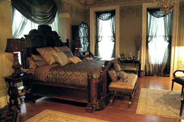
SET DECOR: There are a range of window treatments! Tell us about your choices…
Lederman: Window treatments and practical lighting are two of the most important contributions a set decorator can make to a set. After all, film is light and those two elements shape, create and control the light. Light was almost its own character in this film. It signaled the onset of the effect of NZT, and helped tell the story.
The great variation of window treatments was truly a joy to find and create. I love fabrics and I love what light does to fabric and what fabric does to light.
On this film, window treatments played another important function. As we shot most of our interiors in Philadelphia, what was on the window helped hide the fact that we were not in New York.
The window treatments in Lindy’s Apartment needed to conceal what was actually outside, filter the light, and define her personality. When I was shopping for fabrics, I came across a beautiful natural linen with a motif of giant graphic black flowers, and I thought, “This is Lindy.” We had it made into drapery legs, and combined with gauzy sheers, we had the perfect window treatment for the character.
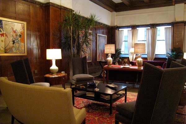
Van Loon’s Conference Room window treatments were a bit of a challenge. The windows were huge. Requiring something corporate narrows the possibilities and the challenge of hiding Philadelphia outside the windows existed here as well. There needs to be just enough fullness to hide what you don’t want to see, and yet still let in the light. We opted for fabric vertical shades, which proved to be an ideal solution. There are some beautiful new things being done with verticals, and we found something quite elegant that was translucent enough to let in the light, hide what was outside and still gave a tailored, corporate look.
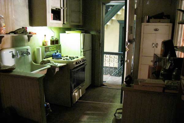
We just had fun with Eddie’s pre-NZT apartment. The scissor window gates were used as window treatments here, alongside some old sheets we hung in the windows to hide the fact that we didn’t have a backdrop outside certain windows.
SET DECOR: Was there a favorite set?
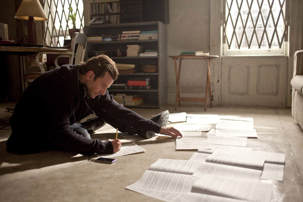
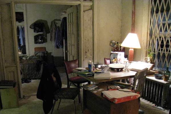
Lederman: Eddie’s pre-NZT tenement apartment was definitely a labor of love. Of course, it’s always fun to do beautiful high-end sets, but I love doing the grungy ones. The challenge is to make it “real”. It’s easy to go over the top and lose believability. Finding that sadly perfect sofa and getting it to just the right level of almost furniture death, improvising with milk crates as wall shelves, layering vinyl flooring and tearing it back to create a history are all strangely fulfilling to me. Thanks to a very talented scenic department, the age and texture was completely realistic and the overall effect was very believable.
SET DECOR: How are Eddie’s NZT-enhanced changes reflected?
Lederman: It actually took a lot of planning to allow for the squalor to then become an orderly world. We see this apartment in many states. We had very little time for the many change-overs, so we had to know in advance exactly how we would achieve this. We had charts and time lines defining each state…
…Pre-NZT was total squalor.
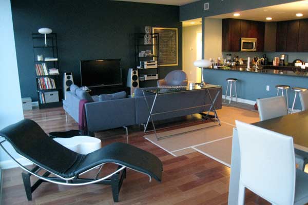
…The first time Eddie is on NZT, he cleans up the apartment and gets organized. …After being on the drug for a while, he starts to buy some new pieces of furniture.
…Then his apartment is ransacked after the thugs break in looking for the hidden stash of drugs—totally torn apart, cushions ripped open, furniture broken, no going back.
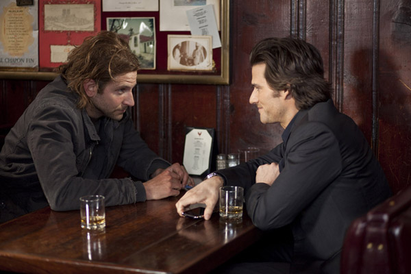
SET DECOR: There is a plethora of bars in this film…from the seedy one where Eddie makes his life-changing connection to funky to luxurious.
Lederman: Part of Eddie’s arc as a character is how NZT allows him to go from an anti-social misfit loser to the most popular guy on the planet. Contrast was important to distinguish the diverse environments he inhabited in his different states of mind. The Happy Rooster, a neighborhood haunt, was the perfect spot to create Eddie’s pre-NZT seedy environment. The refined and elegant world his NZT-enhanced state allowed access to was primarily achieved with location choices.
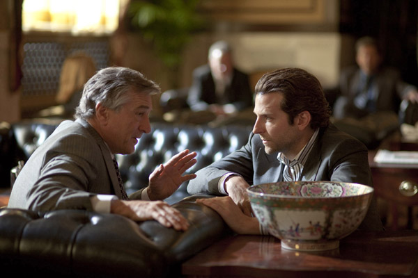
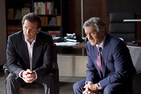
SET DECOR: Luxury and power are visually defined, as in the set where Eddie first meets Van Loon…
Lederman: It was very important for the audience to understand that Eddie was entering a world of power. Nothing says upscale power more than a room filled with tufted black leather chesterfields. The gold sheers were chosen so they could color and warm the light coming through the windows. Combined with the existing mahogany wood paneling in the room, they created the trademark look of the NZT-enhanced world.
SET DECOR: You’ve decorated “power” in NYC before, particularly in WALL STREET: MONEY NEVER SLEEPS. How did you incorporate what you learned from that for this film?
Lederman: Scale. When creating a world that suggests power and influence bigger IS better. The conference table in Van Loon’s needed to be huge. We ended up having to build the table, because I couldn't find one that suited the scene, had the right scale and was to my liking. In the end, the conference table was one of my favorite set pieces. It was enormous, imposing, a true statement.
SET DECOR: What made this film a unique experience?
Lederman: Every film I work on is a unique experience. That is the beauty of what we do. No matter how much I know, how much experience I have, there is always some new challenge that I never came up against before. Set Decorating never gets boring.